

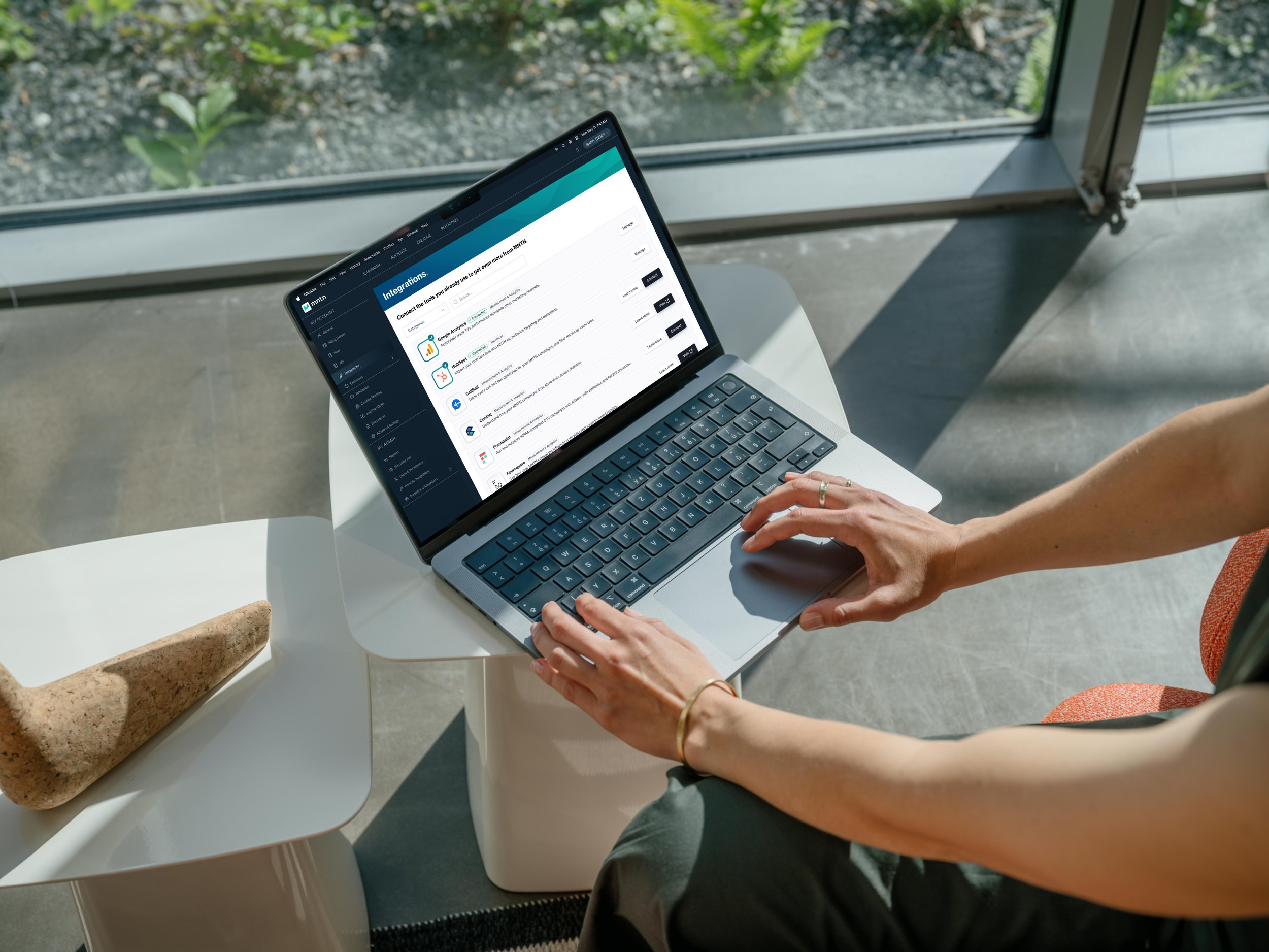
Responsive web UX/UI DesignMNTN: Enabling User Connections on a Growing Adtech Platform
Building scalable flows to help users connect their tools for tracking Connected TV campaign performance, contributing to 67% decrease in Pixel validation time and supporting 2x growth of Integrations.
Role
Sole designer across Integrations and Pixel, from research through engineering implementation
Timeline
Aug 2025 - Apr 2026
Skills
User Discovery
Research
Wireframing/Prototyping
Design Review & Engineering Handoff
Tools
Figma, Figjam
Mobbin
Pendo
Claude, Lovable
Connect Your Tools
Monitor Your Pixel Setup
Background: What is MNTN?Run a TV Ad and Measure Your Performance
MNTN created an easy way for users of any sizeto get on TV and track their metrics, turning connected TV into Performance TV. To unlock even more value from their campaigns, users can connect their tools to MNTN via Integrations and installing Pixels. I had the privilege and challenge to work on enhancing those first-touch experiences.
Constraints for Integrations and Pixel Projects
Fast Timelines with Shifting Requirements

Integrations and Pixel project requirements were each often scoped, designed, and handed off within one week. Requirements could change mid-flight depending on new technical or customer information.
Designing Around External Partners’ Tech

While design and engineering mostly had freedom to modify what was on the MNTN UI (aside from accommodating tech debt and MFEs [micro frontends] on the Premier platform), we did not have control over the partner-side experience. Every design decision had to work around this limitation.
User Feedback Only Came from Post-Launch Data

After design direction was validated from customer discovery calls early on, without access to run A/B testing or live usability sessions, further design decisions were only informed using post-launch Pendo user replay sessions, back-end database queries for completion rates, or trending support ticket issues.
Building Integrations from ScratchProblem #1: Native Integrations Weren’t Built to Scale
There was a strong need to support our users and their wide array of third-party tools with MNTN. By March 2026, MNTN saw a 46% YoY growth in customer base. The roadmap on the Integrations squad was ambitious: Work on 10 integrations each quarter, and always be building 1-2 major native integrations per month.
To make the connection to MNTN, some integrations like HubSpot required OAuth login while others like Tealium and LiftLab required API key input. Each integration was being designed from scratch, with slightly inconsistent connection frameworks, and my job was to not just improve existing integrations but create a solid foundation for building new native integrations to scale.
Thinking BEyond the InterfaceThe Solution: Build Frameworks, Not Just Screens
While discussing the design for both the Upwave and CallRail integrations, I noticed that marketing, product, front-end engineers, and back-end engineers all had different context and misaligned mental models of how the integrations would work. Upwave had many constraints that required manual setup, and CallRail needed to account for agency portfolio management, not just the management for one advertiser.
Because of the complexities for these integrations, it was crucial to map out the architecture and user journey before getting into Figma or even thinking about high-fidelity screens. To get necessary context, I sat in on customer discovery calls and back-end engineering meetings, got acquainted with integration partners’ UI, and researched similar flows on Mobbin.
Upwave service blueprint flows, Including my initial assumption (v0), fully automated future state (v2), and a hybrid version (v1)
Using these flow maps as a living document and source of truth during internal meetings and external syncs allowed the team to discuss tradeoffs easily and align on scope, saving weeks of back-and-forth Slack thread conversations and huddles.
When building so quickly, it’s inevitable that new information arises at the final hour. The team at Upwave would not be able to automate part of the user experience in time for our v1 target date. So when a last minute requirement came in to add a date-picker component to the Upwave connection process, I zoomed out yet again to view its effect on the entire flow. I evaluated the tradeoff of adding another modal screen and total number of clicks, separating the modal flow to reduce cognitive load for the user.
Once a third element about the Upwave study was required, I chose to split the modal into 2 separate tasks to help guide the user.
With this integration, users were able to begin the connection process to MNTN themselves without needing manual support or needing to open and review external help documents.
The Upwave integration shared components with other pre-designed integrations, such as Tealium and Zapier, which centered around API key management. By checking how components could be used across different types of integration types, it allowed me to build designs efficiently, sometimes working on 3 native integration designs in parallel.
This framework had ripple effects beyond just design. It allowed users to see familiar patterns, so they could navigate the UI with confidence as they connect different integrations, and creating re-usable components that fit different use cases let front-end developers implement changes in hours rather than days, freeing up resources to tackle the next integration.
In less than 2 quarters, the number of native integrations designed had more than doubled.
At the start of Q4 2025, there were 5 integrations on the Integrations page. By mid Q2 2026, designs for 6 additional native integrations were handed off to engineering, including 2 that have since fully shipped: HubSpot and CallRail.
Overwhelming Users with OptionsProblem #2: Users Dropped Off During Pixel Installation
The MNTN pixels allowed users to track their website traffic and attribute it back to their TV campaigns. While it was optional, it was highly recommended so users could learn from that data and make tweaks to their campaigns in order to reach their goals, whether that’s wider reach for awareness or more conversions and sales.
When entering the Pixel setup page, users would see all their options to Install and Validate, with 6 different CTAs on the screen. From watching user screen recordings and discussing with the customer support team, we learned users would often choose the wrong install method, fail to test one or both of their pixels, or skip to validation without ever installing.
It took an average of 3 days for the customer support teams to troubleshoot with an advertiser. My task was to reduce the friction points so users could unlock the full value of MNTN within minutes instead of days.
Empowering Users to Help ThemselvesThe Solution: Simplify the Self-Service Path
The first fix was the pixel installation flow itself. I redesigned the flow to be one continuous in-modal experience, reducing the places users could get lost. A user would only see steps for installing once choosing a method, and only be able to validate after going through the install step. This also used an approach similar to the modal connection flows for Integrations.
Previously, each CTA opened a new link or its own separate modal, often causing users to misclick and get lost (Before). The updated page gives the user one clear action (After).
With a guided modal flow, users now only see what’s relevant to where they are in the installation and verification process, proceeding in order.
Another area of opportunity was discovered when designing this improved flow for MNTN Express, the product tier focused on small businesses. The dashboard that users landed on after installing pixels on MNTN Premier wasn’t built for clarity. The Pixel page didn’t look like it was showing setup status but looked more like a reporting page, showing site visits and conversions from the previous day, even if they weren’t attributed to MNTN.
The pixel setup is ideally “set it and forget it,” but it could be disrupted when websites got updated. When going to this page, I wanted to help answer for the user: Are my pixels set up correctly, or do I need to take action? Rather than highlighting site activity numbers like in Premier, I focused the design on the overall pixel status for Express and flagging the user to address any Fair or Poor pixels.
Getting to this solution required discussion with the engineering team to understand how data was stored, queried, and displayed to the user.
The MNTN Express Pixel content card focuses on actions required by the user and informs why something may have gone wrong.
Additionally, unlike MNTN Premier, which was the classic platform on which users had big budgets and used desktop browsers to tweak advanced levers for their campaigns, on MNTN Express, small business owners on the go needed a way to monitor their campaigns and status on mobile. This was validated in Pendo, where we saw mobile device types accounted for 48% of the Express sessions.
A smaller card stack on mobile allowed for the same design language as the larger table and keeping elements on the page, rather than using a horizontal overflow for the desktop viewport size.
Pixel validation time dropped by 67%.
Both the updated install flow and dashboard improvements bring an easy and consistent user experience across the Premier and Express tiers. Time to get pixel setup self-validated decreased from 9 minutes to 3 minutes, allowing users to get back to building their campaigns that much sooner.
A Look back on the JourneyReflections
Biggest Win: Staying Organized Across a Fast-Moving Roadmap
Starting every project by creating shell tickets on Jira, creating draft files in Figma, and digging for internal/external resources helped me stay ahead of engineering. By the time I received requirements, I had some familiarity with what I’d likely be building, and this helped me juggle multiple projects at once.
Biggest Takeaway: When to Use AI Prototypes vs. Figma
A more nuanced lesson during my time at MNTN was when to create AI prototypes vs. Figma designs. Using AI tools, like v0, Lovable, or Claude, are great for ideation and testing different layouts with just a few lines of text prompts. However, I noticed how quickly non-designers were eager to sign off on the high-fidelity mockups without questioning the true user experience and elements on the page. The tool is only as useful as the shared understanding around it, and sometimes it’s still faster to get into Figma and mock up something 100% intentional, where each element’s presence has been hand-selected.
With More Time…
With more time and resources, I would set up consistent usability testing throughout the design process. Prototypes were walked through during several customer calls, but there was no way to capture how a user would behave before something was built.
Beyond research methods, a more mature component library in Storybook and the ability to test changes in a local dev environment rather than in Figma would have allowed for a smaller gap between design and engineering.
Thanks for perusing!
If you’ve made it this far, I appreciate the time you spent reading this case study. If this work resonates with you or what you’re building, I’d love to connect.
