

Muttville
Tripling user performance on the Muttville Senior Dog Rescue website by redesigning for mobile-first experiences to boost foster and adoption numbers
Jump to Interactive Mobile Prototype
Jump to Interactive Desktop Prototype
Prefer a PDF? Request the slide deck
Note: This project is not officially affiliated with Muttville. Thoughts and proposed modifications of the website are my own.
Project Deliverable
Responsive mobile/desktop redesign of the Muttville website
Timeline
4 weeks
Role/Skills
Sole Designer:
UX/UI Design, Prototyping, Testing, Research, Information Architecture, Content Strategy
The PRoblemKey Adoption/Fostering Information is Buried in Dense Text
Muttville is a cage-free rescue, and shelter space is limited. The organization relies heavily on its fosters and adopters to help make room for more dogs to be rescued. On the current Muttville website, the Home page lacks strong call to action, and the Fostering page primarily consists of long paragraphs describing the process.
The SolutionRedesigning a Mobile-First Solution to Improve Scannability
The website was redesigned to prioritize the mobile experience:
Utilize bright colors to draw attention.
Add visual hierarchy for the varying calls to action (adopting, fostering, other ways to get involved).
Place the main call to action above the fold to prevent website abandon.
Use bullet points over paragraphs to improve information download/recall.
On the left is the current Muttville website’s Fostering page, and on the right is the prototyped solution. At a glance, the same information becomes digestible. From testing, we found users were able to identify key information 3x faster on the prototype than on the current website.
Conducting ResearchComparative Analysis & User Interviews
What We Learned
-
With each shelters working differently and so much information to process, users need to be able to access key information (fast facts, dog traits, photos) as quickly as possible.
-
Fosters mostly find need-based dogs through internal volunteer communications or Instagram, while adopters sort/filter and have more criteria while browsing on shelter websites for a permanent pet.
-
Regardless of whether they are fostering or adopting, users looking for an older dog care the most about the dog’s reactivity/compatibility with other dogs, cats, and children.
Taking Visual Hierarchy Cues From Other Shelters
While doing a comparative analysis of other shelters, I noticed several trends:
They highlighted a clear CTA high up on the page, used bright colors, and re-emphasized the CTA at the bottom of the page.
Dog traits and facts were bulleted points, with icons and/or bold text to draw attention to them.
Carousels of photos and videos were also higher up on the page.
Hearing Firsthand from Previous Fosters and Adopters
After user interviews, I learned how different the foster and adoption paths were, not just in their care for the dog but in their experiences with the shelters. Users tended to be split 50/50 on which device to browse on (phone vs. laptop), but most users used their laptop when sending in their application.
I interviewed 9 users, aged 30-45, based in the U.S. who have fostered and/or adopted a senior dog. Quotes from their interviews are below:
Our Main Persona
Using the information gathered in user interviews, the main persona chosen for this project was a pet lover who volunteers with her local shelter often but is ready to bring a senior dog around at home, whether it’s a foster or an adopted pet.

Defining the opportunityHow Might We…
enhance the website’s layout, dog profiles, and application process and highlight educational resources to create a more intuitive, engaging experience that supports potential adopters and fosters?
Bringing it togetherDeveloping a Solution
Product Focus
Being a pet caretaker is no small feat! It was just as important to draw people in and encourage them to foster/adopt as it was to inform, educate, and empower them to do so successfully. With that in mind, I had 4 main goals with my redesign:
Reorganizing the Sitemap
Muttville’s current website sitemap had a flat/non-existent hierarchy: Most pages weren’t nested under sections and the paths were on muttville.com/#. To restructure the information architecture and make sure that pages properly linked to each other throughout the website, I used Octopus.do to build a sitemap and low-fi wireframes.
While I was not intending to redesign every page on the website, I created a fully wireframed sitemap so that the team at Muttville would be able to use my recommendation for any future site improvements.
Prioritizing Features
Although all the pages on the website are important for the user, with a limited scope and timeline, features needed to be prioritized. All of the potential features were mapped out on an effort/impact matrix and are color coded by the status by the end of the project.

Designing and Slowly Improving the User Flow
The screens I decided to redesign for this project were the following:
Home
Foster
Available Mutts (adoptable dogs)
Adopt (Process)
Individual Dog Profiles
Applications (both for Fostering and Adopting)
I also wanted to add a new page, where first-time dog caretakers could learn about senior dogs. This page was originally titled “Is a Senior Dog Right for Me?” but was later renamed “The Senior Charm”.
The main user journey: A dog-lover walks by a Muttville event and visits the Muttville website on to learn more about senior dogs. They look at all the adoptable dogs, is interested in one, and opens the profile. On the profile, they see the dog is in need of a foster, so they learn more about fostering and then decide to apply to become a Muttville foster.
Highlighting Adoptable Dogs and Informing About the Adoption Process
After low-fi testing, I decided to split the pages again (as they are on the current Muttville website), but with the following additions:
Placing two big CTA buttons on each page: See Available Mutts/How to Adopt as the primary, and Apply to Adopt as the secondary
After high-fi testing, I improved these pages even further:
Adding a preview of the adoption process at the bottom of Available Mutts
Adding a preview of available dogs at the bottom of How to Adopt
Challenges During Development
There were two main challenges I faced during development:
Organizing lots of key details and information about the foster/adopt processes in a non-overwhelming way
Balancing transparency vs. need to know information, especially surrounding a pet’s medical history
To address challenge #1, I focused on:
Breaking up text into small groups and inserting graphics throughout
To address challenge #2, I focused on:
Adding a sorting functionality, so that no dogs would be immediately filtered out without a chance of being seen
Providing bare minimum medical requirements up front, but making sure foster notes included portraying the dog in a positive light despite any medical needs
user-centered design in actionTesting & Revisions
Usability Testing (Mobile)
Testing was conducted with 5 participants who were based in the U.S. and wanted to someday adopt or foster a dog. It was important to choose people who hadn’t gone through the process before to understand how a first-timer would interact with the website.
I moderated the test either in person or over a video call with screen sharing to track where and when the user hesitated or misclicked on the prototype.
The test had 3 main task flows and 3 follow up questions around their test experience.

Both the website structure and content were tested on the mobile prototype.
When testing usability of the Fostering page, users were also asked to perform a task on the current Muttville website. They were tasked with identifying (different) pieces of information on the current website and on the prototype. Most users were able to complete the task significantly faster on the prototype, an average of over 3x performance improvement.
Final Revisions
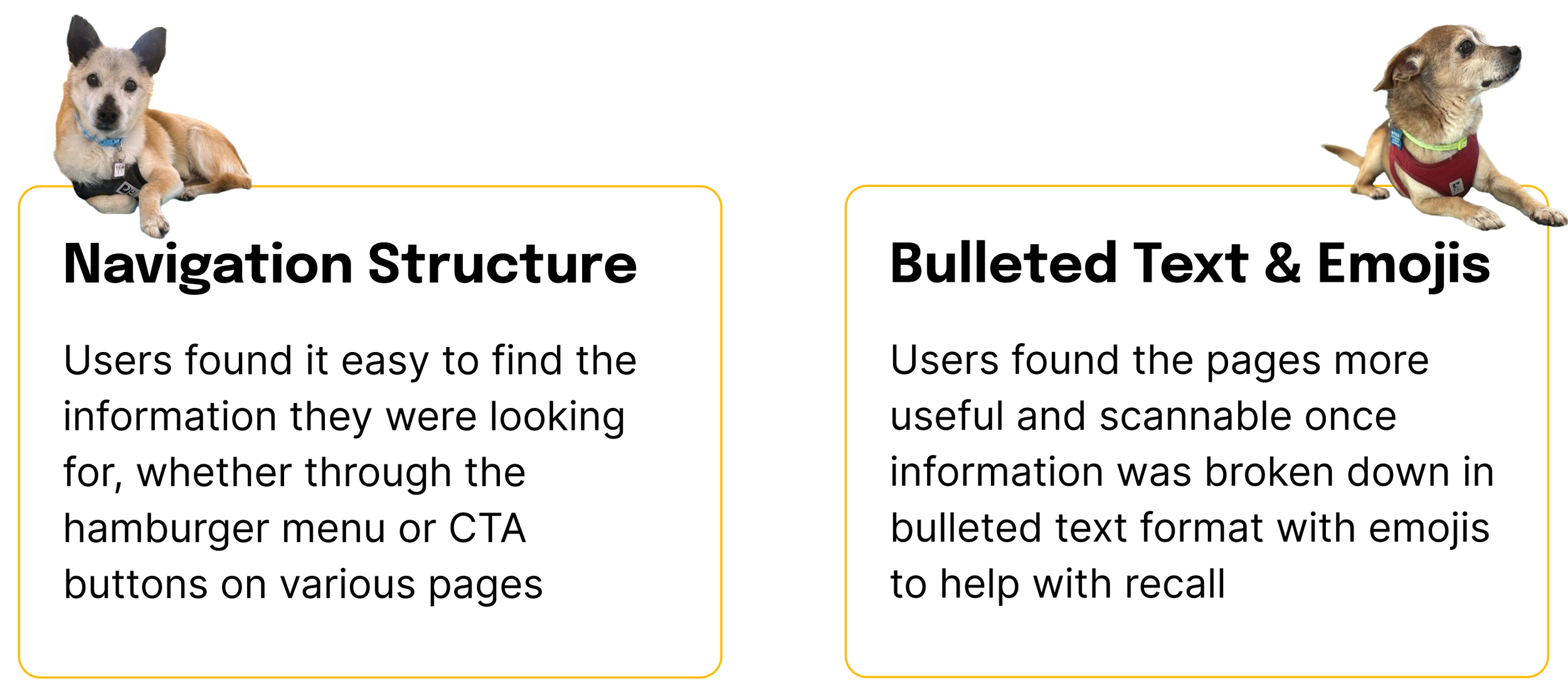
Target areas for revisions were determined by user feedback and the features with low-rated success metrics. Overall, users felt the navigation and Home page layout was very clear, but the content on the Dog Profile pages and Fostering pages were still confusing.
Several people had very basic questions that should have been answered on the Home page, such as: What defines a senior dog? Where is Muttville?
For improving information recall, the amount of text on the page could not be reduced further, but they could be broken up more to allow for easier processing.
Before & After: Spacing Text Elements and Distilling Down Traits to Improve Information
Before & After: Highlighting Testimonials by Breaking Them Up
Before & After: Displaying Must-Know Information Upfront With Cards and Extra Padding
Before & After: Improving “At a Glance” Scannability By Adding White Space
Consistent ExperiencesDesigning for Desktop
After nailing down the mobile experience, I moved on to designing the desktop experience for the following key pages:
Home
Fostering
Dog Profile
While I was able to expand and add slightly more content, I still wanted the desktop experience to be nearly identical to the mobile experience.
The final mobile and desktop prototypes are below, feel free to click around! Keep reading to see takeaways and next steps.
A Look back on the JourneyTakeaways, Impact, & Next Steps
Reflections
What Went Well
What I Learned: Information Should Be Beginner-Friendly!
There are other ways to reduce clutter without removing text:
Increasing padding and adding a background color to text can really help break things up for the user.
Words really matter:
For those new to the animal welfare community, “Sponsor Me” may be more confusing than “Donate”, even if it’s more specific to the intended call to action.
Subtle wording changes can dramatically change the tone. For example, “foster needed” creates more negative-sounding urgency than “available for foster.”
Other words that were confusing to first-timers where clarifying text/context clues would have helped: senior, compatibility, foster vs. adopt.
Assumed Impact & Results
As a result of redesigning the pages for improved scannability and information recall, I would expect the following results:
Higher number of foster/adoption applicants
With CTA easily found, I would expect a higher number of applicants for both fosters and adoptions. The digestable chunking of information and the FAQ sections will empower first-timers to feel more confident towards taking the first step.Higher percentage of successfully converted foster/adoption applications
With key information being more visible, such as compatibility and medical details, I would also expect that fewer candidates drop out of the application process. They will have a better picture of the dog they are interested in before their first meet and greet.Freeing up internal resources due to a fewer number of inbound/info request emails
With questions about Muttville as an organization and the rescue processes easily found on the website, I would expect that fewer people to send general information request emails to the Muttville team. Since the organization is largely volunteer-run, resources could be better allocated for animal welfare rather than answering surface level questions.
Next Steps
Test Usability and Information Recall on Desktop
With more time, I would want to compare people’s behaviors and ability to digest information when browsing on a desktop.
Evaluate Additional Features
With more time, I would want to evaluate adding in the following features:
Embedding a 3rd party application system within Muttville’s website for more customization and status tracking and reminders for applicants
Redesigning the Events/Calendar pages to include an Add to Calendar feature and embed the Calendar at the bottom of each page to reduce clicks
Including a Rescued Dogs counter on the Home page to motivate people to join the cause and celebrate each win
Collect Post-Launch Metrics
After the launch of the redesign, I would want to collect data regarding both the newly designed pages and the existing pages on the website, to identify other areas of optimization.
Thanks for perusing!
If you’ve made it this far, I appreciate the time you spent reading this case study. As a Muttville Alum parent (to a sweet 15 year old dog), Muttville is so near and dear to my heart. I hope my case study findings can boost adoptions and fosters, and at the very least, bring awareness to Muttville and why everyone should give senior dogs a second chance at life. If you have any questions about it I’d be more than happy to chat about the process and any of the findings.
If you like what you saw, send me an email and let’s talk about working together! (If you didn’t, you can still send me an email because I appreciate getting all feedback.)
