
Kiln UX with (and without) Claude Code
TL;DR: I used Claude Code to explore design improvements for Kiln, a product intelligence platform that provides customer insights. It was exhilarating (!) to experiment using Claude when Figma designs didn’t exist.
“Do whatever you want to the UI. Don’t worry, you’re not gonna break anything.”
Yes, this is what every designer wants to hear, and no, I didn’t dream this.
Two of my friends Andre and Thomas (The Boys, as I will be referring to them for the rest of this post) started working on a new passion project, Kiln, and they were looking for some UX guidance. They spent the majority of their time developing the backend and did not have as much bandwidth for the frontend. In short, I was given the freedom to play around and make “whatever design changes I wanted” to their platform.
With Kiln, users can pull insights from their customer calls to help shape their roadmap. As someone who has always been interested in learning how product direction is prioritized, I thought it would be great to explore improving a tool that made the customer feedback part of the process easier. My goal was to make the frontend as navigable as possible so users can get the most value out of their data and interactions.
Because it was just the two of them coding away, there were no designs on Figma. I would be modifying code and testing on a local dev environment before pushing design changes directly to the website. This was a new way of working for me (I started the process at MNTN but then got laid off reduction-of-forced before I could do any experiments with my copy of the code base). Since Kiln didn’t have any customers, I felt more at ease to mess around and was extremely grateful to have a safe space to explore with 2 friends to help me troubleshoot.
Plus, with YouTube university and a Claude subscription, anything is possible.
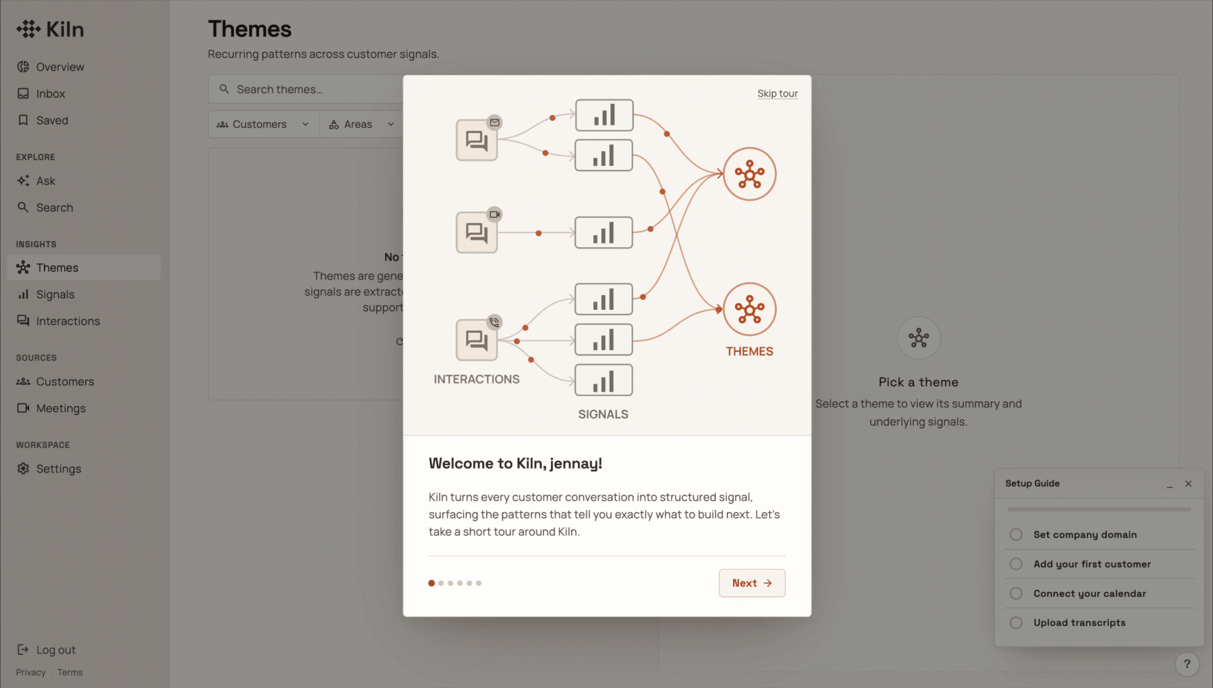
An early screenshot of the Kiln interface before I ever touched it, already looking pretty good
At first glance, it seemed like there wasn’t much for me to do. But that’s exactly the risk of using fully AI-generated interfaces! It takes very little for a UI to look polished; with rounded corners, subtle drop shadows, and icons, one might think the design is nearly finished until they actually tried to use the product.
Starting with Jenny’s brain before Claude’s brain
I put myself in the shoes of their target user and walked through simple actions like connecting my Google Calendar and reviewing details about my Themes. I found several areas for the user experience and flow to be improved. Clicking on elements jumped from page to page without continuity, there were a lot of repeating elements across pages/containers, and the most important parts of the page were cluttered with redundant information.
To make sure I didn’t miss anything, I used Claude Chat to create a Figjam artifact of the user journey diagram. I don’t think it did a great job making the diagram itself, but it did do a good job asking about edge case questions (UI changes depending on user role permissions and what constitutes as a mandatory task).
I conducted a heuristic evaluation to step through the platform methodically, trying to run into these edge cases and break as much as possible. Then, I fed my spreadsheet of notes and feedback into Claude and asked it to generate a new tab of features and bugs, ranked from P0-P3, that each pointed to the detailed heuristic evaluation checklist as evidence. This allowed me to prioritize the order in which I would tackle features.
I found Claude to be a great co-planner. Not only was it pretty good at prioritizing changes from my feedback (save for putting a few polish things as P0…) but it was very helpful for creating a plan for responsive design. It mapped to the Tailwind breakpoints and suggested ways to treat the two column panels on smaller screens.
The magic of designing with coding agents…
I started with the easiest P0 task: Legible font colors. I wanted to respect the color palette that Andre and Thomas The Boys originally chose, but make sure that accessibility was considered.
My prompt (I used Cursor for this first one as I was still figuring out which coding agent I felt the most drawn to):
Can you review the entire UI and then update which color tokens are used for text so that all of the text pass WCAG AA contrast ratio (foreground text on background color)?
It took less than 5 minutes for the agent to audit the color combinations across all pages and update the color scale to make the text legible.
I appreciate that coding tools give you a summarized report after all of the “thinking” steps.
Writing this change to production and skipping handoff meetings and checks felt CRAZY. Sure, it was almost imperceptible on the UI, but this was the first time that I was able to “implement” a change to a website of this complexity without needing to go through any engineering handoffs.
Baby’s First GitHub Commit (technically I used Cursor for this first one)!!
Aside from being able to plan, adjust, and implement quickly, coding agents are great for doing things that help to fill gaps. One of the first things I noticed was that there were inconsistent UI elements throughout the platform: Different icon sizes, different button styles, different hover states. The Boys have no designers to maintain a Figma design library and it would’ve been overkill, so I suggested creating the component library in Storybook as a source of truth to review components and variants. Instead of using another third party tool to keep track of the components, Thomas created a Components page for us to view everything altogether.
Granted, this needed its own cleaning up: the SubmitButton and SaveButton had their own sections rather than being captured by the Button component - but it was a good enough place to move forward. From then on, Claude was asked to make all UI changes by pulling from the internal component library before creating new elements. In the future, it might make sense to have a more formal component library, but for now just having a page for reference is sufficient.
…And the sometimes frustrating nature of coding agents
That being said, it wasn’t all rainbows and sunshine, as anyone who’s tried to build with coding agents knows. Despite asking for Claude to re-use components, sometimes deep into a conversation I’d realize it just created a new one. I had lots of back and forth iterations, causing me to use /compact more than I would have liked to admit.
I had to attack several issues from multiple angles, since Claude wasn’t “seeing” what the issue was. For example, I sent Claude the same screenshot, 3 different ways, trying to troubleshoot why the calendar grid lines were not aligning properly. The first two times Claude tried to gaslight me into thinking it was fixed.
Claude, do you need to wear your reading glasses? This extra 1px haunted me for far too long.
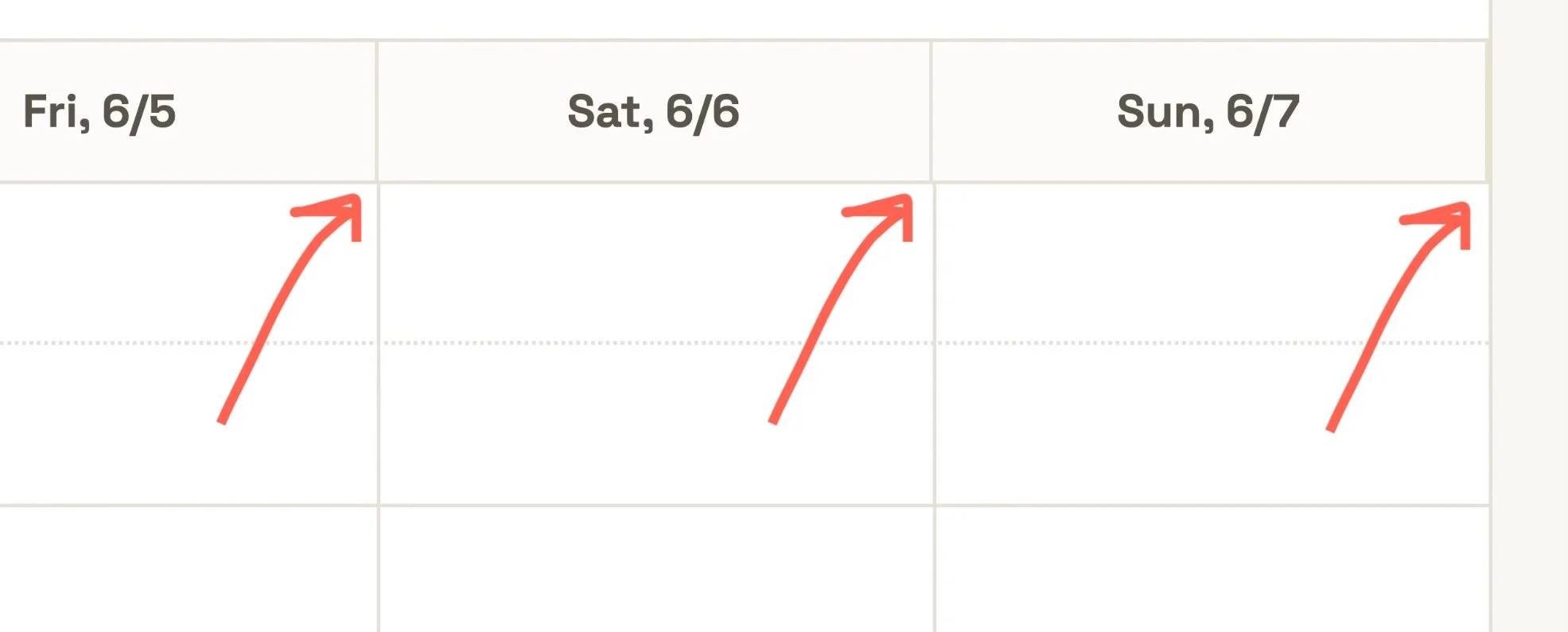
“Coding” was especially frustrating while designing the mobile version of the website; since Kiln was originally designed for desktop, almost all of the page layouts had to change to fit on tablets and phones. I created a product tour for user education, and the tooltips were hidden by navigation elements, bleeding off the page, or being placed in a mysterious x,y position that pushed it into the corner. Frequently, making a change would update the z-height of a random shadow and I would see dropdown menus hidden in the same containers as their selector elements. All of these issues took multiple prompts to correct.
Prompting to Claude reminds me of trying to speak broken Mandarin with my mom, who is a native speaker. I workshop different intonations and shapes of my mouth, yet she keeps not understanding what I mean. She’ll figure it out eventually and correct me, but I’ll be convinced that’s exactly how I said it the first time. (Well, apparently not.)
Using Claude’s Chrome extension for quick mockups
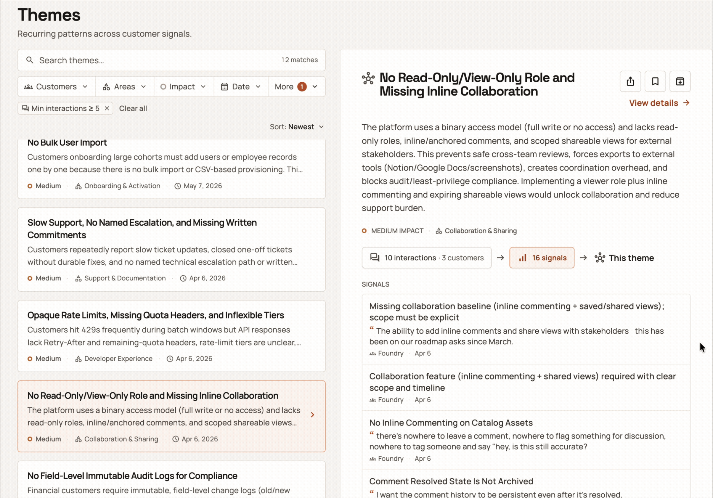
The ability to tab between Signals and Interactions without leaving the Theme preview panel was originally prototyped in the browser using the Claude for Chrome extension.
Rather than using worktrees, we pushed directly to the main branch, for simplicity. However, this made it hard for me to see side-by-side comparisons for different UI elements, especially when Figma designs didn’t exist. I tried to use the Figma MCP to generate a design from Claude into Figma but the designs didn’t look 100% the same. For testing out an interaction with motion, I wanted it to not just work but look the same as the existing UI. As a workaround, I used the Claude for Chrome extension to mockup the way that a user could switch between relevant Interactions and Signals while staying focused on one Theme’s preview panel.
Pros: Fast, uses the page you’re on as a canvas, good at mocking up exactly what you want changed
Cons: No chat history saved, super token-hungry, no way to share changes without a screen recording, changes disappear as soon as you refresh the page (this last one sucks when you accidentally swipe Back on your trackpad… ask me how I know)
Because of the cons, I used this sparingly when I was testing out an outlandish concept that I didn’t want to bother reverting in code. If I liked what I saw, I would ask the Chrome extension for the text to copy-paste into Claude Code.
Side-note: When credits allow, I still like Claude for Chrome extension because it has context of a page without needing any local files. I recently used it to plan and implement a system-level dark mode theme to this website as well as adding the read time to my blog posts, as Squarespace does not have those as native features. So cool!
Using the /figma-generate-design skill to review items side by side
I eventually needed to use Claude to bring in some designs into Figma to get layout consistency across multiple states. I had already removed, via prompting, lots of redundant information (classssic vibe-coding) from the Meeting drawers, but since Claude had pre-generated individual components, elements that described the same things were designed differently. Though /figma-generate-design did not create pixel-perfect recreations, it was accurate enough to show the inconsistency across states, made more obvious when all were next to each other:
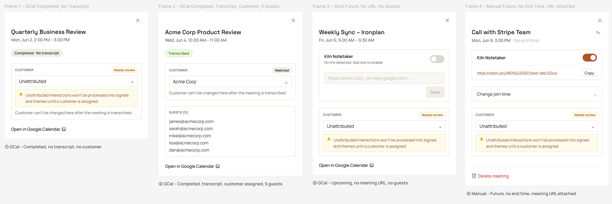
The over use of borders, varying font sizes, disappearing elements causes an inconsistent feel with no visual hierarchy
Being able to re-order and modify the components in the drawer using Figma felt marvelous. Even though I was getting the hang of prompting in order to make design changes, it still felt the most natural to drag and drop items without having to put into words what I was trying to do. Plus, it took just a few seconds and costs 0 tokens to do.
Another area of the product where it was helpful to see things visually side by side was for the onboarding product tour. I had Claude generate a table with each step so I could view the content of the whole tour, and it mocked up ASCII art style wireframes to review the layout. I reviewed these before having it build it in the code, but each view required restarting the tour and clicking through the steps in order to see my changes. On one hand, it was great that it was already in code to get a feel for what the user would experience, but it was also quite tedious to do over and over again, just to see what needed to be iterated. I used the generate-design skill again, and without any components in Figma, Claude did a pretty good job recreating the overlay tooltips.
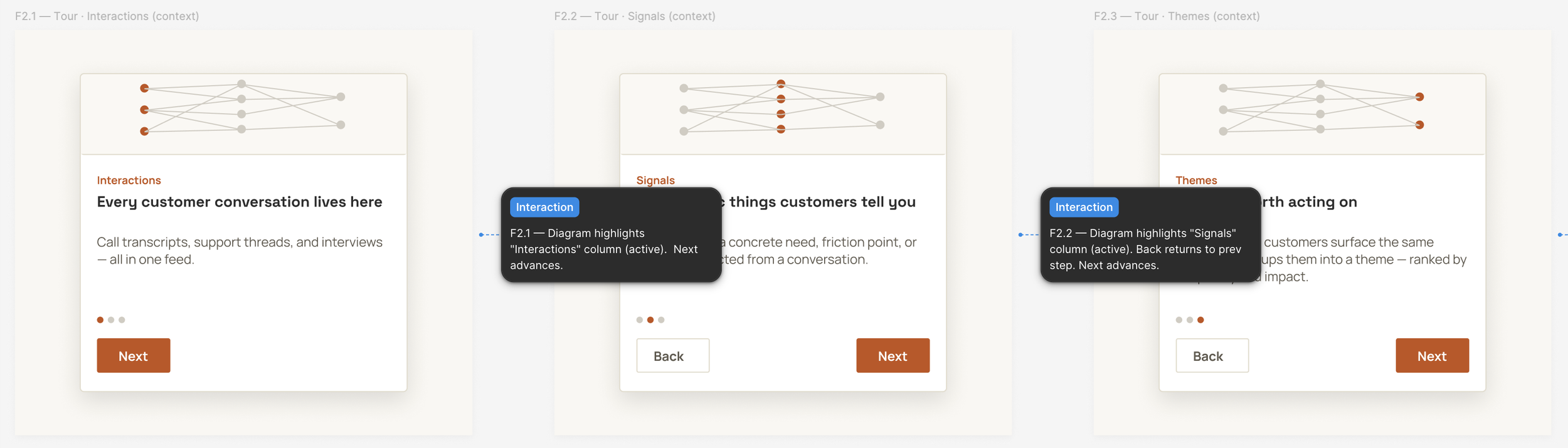
It was helpful to see higher fidelity steps of the product tour all at once. The generated annotations were redundant in my case but I could see them being really crucial to communicate behavior/intent for more complex and multi-screen designs.
An area where I went back and forth between Claude and Figma was not actually for product screens but for the product tour illustration and animation.
Creating an animation from pen and paper, to Claude, to Figma, to code
Kiln’s main feature is providing concrete insights taken from customer conversations. Each conversation is an Interaction, from which Signals get drawn, and with enough Signals of a similar grouping, Themes get created. To make sure I fully understood how it worked, I drew a sketch in my notebook to check with The Boys. They joked that for the onboarding process, we should just include my sketch.
I uploaded my sketch to Claude and gave it a detailed overview of what I wanted to see in the product tour.
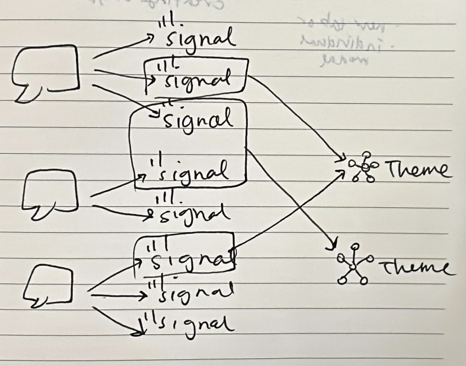
The sketch: Chicken scratch in my notebook
The reference: Slack product tour
The result: A pretty good start
I wanted to tweak the initial illustration Claude generated without duplicating work to recreate the wheel. I located the SVG file that Claude generated and imported it into Figma to be modified further. Once I finished editing the vector, I uploaded it back into Claude. What I felt was so cool about Claude was that it not only could change the opacity of my vector lines depending on the tour step, but it could also add dots to travel along the arrow lines between insights, and just with prompting I could update the animation parameters, such as the opacity levels for each step and the speed of the dots.
Because graphic design is not my strong suit, I thought it was awesome that this simple illustration could be brought to life with Claude Code. It blew my mind that animations could be completely coded like this, and it allowed for easier editing when I could see it rendered in the dev environment rather than trying to set up each part of the animation in Figma.
The illustrated steps 1-4 of the product tour, all of this built off of one SVG. Siiiick.
My Kiln experience with Claude Code
All in all, I made 97 commits in the 3 weeks I was learning Claude Code. (I learned during that time that I should be making more frequent and shorter commits rather than fewer but longer commits.) The UX/UI changes I made fell into the following 2 categories (basic UX/UI fundamentals and Kiln-specific features), which helped me stay focused for what to prioritize. The table stakes work was great practice for any product that I’d work on, and working on the Kiln-specific features helped me practice making data-heavy surfaces more user friendly. (The platform used mock-data for testing.)
Table stakes, UX/UI fundamentals
Responsive design and updating the 2 column approach for smaller viewports
Helpful error messages rather than computer word-vomit jargon
Consistent UI elements and re-using components when possible
Onboarding and user education
Kiln-specific
Displaying meetings: connected via Google Calendar or manually added
Displaying customer insights (Interactions, Signals, and Themes)
The biggest challenge for me while making changes was having to prompt with words and loose sketches rather than being able to drag components around on Figma. The silver lining about this approach was being forced to reflect and justify a design change. Some questions I asked myself were: Was it worth the tokens? Could I go into the TSX file and edit the content myself? Why did I need to move this component?
Where Claude could not help
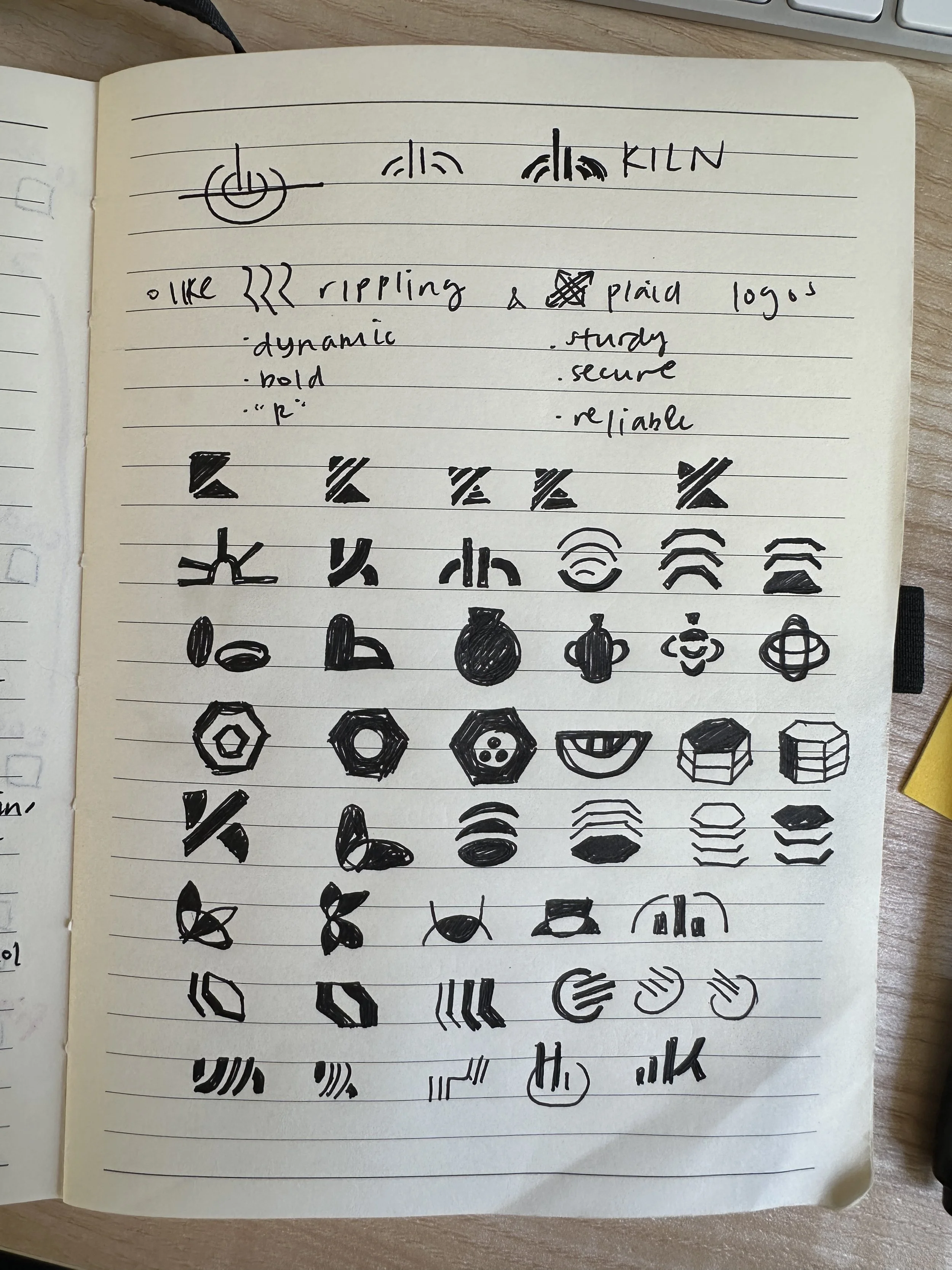
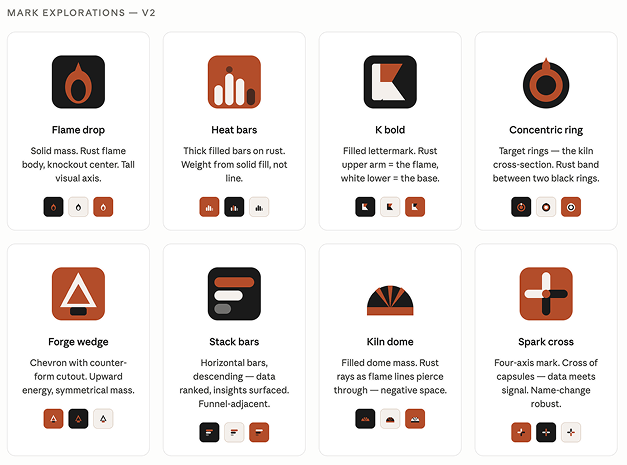
One other thing I did for Kiln was update the logo. When creating visual assets that aren’t just standard UI elements, I don’t like starting with AI (mainly for fear of atrophying the muscle to generate my own ideas) but I do like using it as a collaborator for brainstorming. When it comes to logos, my favorite place to start is just with pen and paper. It’s how I came up with all of my logos (past and present) as well as the logos for Yond and Chatful. The Boys said they liked the Plaid and Rippling logos - I would describe the tone of their logos to be bold, secure, dynamic, confident, and intelligent, so I tried recreating that in my sketches.
My initial sketches, many which use a kiln motif
Claude’s suggestions (and you’ll notice it’s the 2nd iteration)
Both of these initial concepts from me and from Claude center around a kiln, and so I was hoping I could riff on Claude’s suggestions… But as the kids say, What the helly?
Needless to say, The Boys weren’t really feeling them. They wanted something simple and geometric and not kiln-related, so I went back to the drawing board, this time jumping directly into Figma.
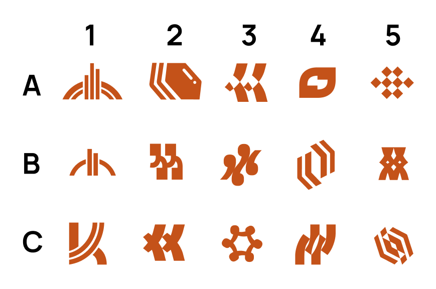
The final proposal sent to The Boys for selection. Can you spot the winner?
After being away from branding exercises for so long, it was nice to get back into Figma and work on some designs. These designs were based on either being kiln-related or quotation mark related. A5 won for its simplicity, and what I love about this logo is that it is made up of 2 sets of quotation marks from an 8-bit style font, Micro 5. The quotation marks are stacked on top of each other, and rotated 45º to become a symmetrical diamond grid shape. It reminds me of ceramic tiles or pieces fired in a kiln from a bird’s eye view, and is also perfect to represent pieces of data coming together to tell a cohesive story.
It’s simple but bold, and c’mon, AI could neverrrrrr.

I made a fun animation on Figma to showcase the new logo!
Closing thoughts
This blog post ended up being way longer than I intended - if you made it this far, thanks for sticking around! It was great to reflect on my experience, and I actually did a lot more than I thought I was going to in just 3 weeks. I could really multi-task, and not just running several code sessions at once to work on different parts of the UI in parallel. Using Claude Code also allowed me to be off the computer more. With just one word, “push”, I could walk away and go brush my teeth or work on make another cup of coffee, knowing the agent was handling the pre-commit testing and troubleshooting.
I have a lot of respect for actual software engineers and I enjoyed getting a glimpse into that world, feeling more enabled because of AI tools. I learned A LOT - about how to use Claude Code and a bit more about software in general. I panicked when some of my features required modifying the database structure, but by the end, I got more confident using Claude Code with backend related things (for things even as simple as generating access keys to connect to Supabase). The Boys were super supportive anytime I got stuck where Claude could not help.
While it’s a bummer that I had lost my full-time job, I feel grateful for free time and mental bandwidth to tackle something new. It feels so rewarding to have done work directly in code, knowing that how I left it is how it looks on the UI. Of course, there’s more to do to improve, but I feel proud of my accomplishments going from idea to production.
If I taught you a new use case for Claude in your design process or if there’s a different way you would have achieved some of the things I did, let me know in the comments!
